
Four sources hold the answer: the Microsoft 365 admin center usage report, the Viva Insights Copilot Dashboard (with Advanced Insights for analysts), Microsoft Purview audit logs, and GitHub’s Copilot usage metrics with NDJSON exports for developer teams. Before pulling a single number, confirm every licensed seat has Copilot enabled and telemetry turned on, since a misconfigured tenant will quietly undercount your real adoption. Once that’s verified, exporting and interpreting the data becomes straightforward.
TL;DR:
- The Microsoft 365 admin center usage report provides a quick snapshot of Copilot adoption, including active versus enabled users and prompts submitted per app.
- Cross-referencing multiple data sources, like Viva Insights, Purview logs, and GitHub metrics, is essential since each answers different questions and uses different attribution methods.
- Proper access roles, timely exports, and consistent data verification are critical to accurately measure and interpret Copilot usage over chosen timeframes.
- Usage counts alone do not predict ROI; tracking engagement ratios, prompts per user, acceptance rates, and development cycle metrics offers deeper insights into value generated.
- Rebuilding workflows around Copilot, rather than just training, drives sustained adoption and measurable billable time recovery, especially when data is reconciled beforehand.
Table of Contents
- Where to Find Copilot Usage Analytics Across Microsoft and GitHub
- How Do You Access and Export These Reports?
- Which Copilot Metrics Actually Predict ROI?
- Why Do Copilot Dashboards Show Different Numbers?
- Building a Weekly and Monthly Copilot Reporting Cadence
- Turning Telemetry Into ROI: Exports, Joins, and the Fields That Matter
- How Zera Turns Copilot Telemetry Into Recoverable Billable Time
- What the Data Actually Tells You About Copilot Adoption
- Get Help Turning Copilot Telemetry Into Billable Time Recovered
- Official Copilot Reporting Docs Worth Bookmarking
- Sources
Where to Find Copilot Usage Analytics Across Microsoft and GitHub
Each reporting surface answers a different question, and mixing them up is the fastest way to misread your adoption story. The Microsoft 365 Copilot reports for admins documentation lays out four primary sources, and knowing which one to open first saves hours of chasing the wrong dashboard.
- Microsoft 365 admin center usage report. This is your readiness check. It shows enabled users versus active users, total prompts submitted, average prompts per-user, and adoption broken down by app (Word, Excel, Teams, Outlook). If you need a fast answer to “how many of our 200 licenses are actually being touched,” this is the report.
- Viva Insights Copilot Dashboard and Advanced Insights. This layer goes past raw counts into productivity impact and ROI indicators. Advanced Insights adds an analyst workbench with prebuilt Power BI templates, letting an Insights Analyst blend Copilot data with calendar, email, and collaboration signals to see whether usage is actually changing how people work.
- Microsoft Purview audit logs. When you need prompt-level detail (who asked what, when, and through which app) for a compliance review or a security investigation, Purview’s AIApp workload logs are the only source with that granularity.
- Copilot Studio, Power Platform analytics, and GitHub Copilot usage metrics. For firms building custom agents or using GitHub Copilot in engineering teams, these are separate telemetry universes entirely. Power Platform analytics track agent performance and usage inside Copilot Studio, while GitHub’s dashboards report developer-centric numbers like acceptance rate and Lines of Code.
The mistake most IT teams make is treating these as interchangeable. They’re not. The admin center tells you if people are using Copilot. Viva Insights tells you whether it’s working. Purview tells you exactly what happened. GitHub tells you a completely separate story for your engineering staff, if you have one. A managing partner asking “is this thing paying for itself” needs at least two of these sources cross-referenced, not one dashboard glanced at in isolation.
How Do You Access and Export These Reports?
Getting to the data requires the right role and a bit of navigation, since Microsoft and GitHub split admin permissions differently. Here’s the sequence that works for most mid-market IT teams:
- Confirm your role. You’ll need AI Administrator or Global Administrator access for the Microsoft 365 admin center report, an Insights Analyst role for Viva Insights Advanced Insights features, and an Audit Reader (or Compliance Administrator) role for Purview. GitHub requires organization owner or a designated Copilot metrics viewer role.
- Sign in to the right portal. Microsoft 365 admin center for usage reports, the Viva Insights app for productivity dashboards, the Microsoft Purview compliance portal for audit search, and your GitHub organization settings for Copilot metrics.
- Select your timeframe. Most Microsoft reports let you toggle between 7, 28, 90, and 180 day windows. GitHub’s dashboard defaults to a rolling 28 day view with historical comparison.
- Export the data. Microsoft reports typically export to CSV directly from the browser. GitHub’s Copilot usage metrics can be pulled as NDJSON through the REST API for teams that want raw, machine-readable records.
- Load into your BI tool. Import CSV or NDJSON into Power BI, or set up a scheduled API pull if you want the dashboard to refresh automatically instead of manually re-exporting every week.
Pro Tip: Set up your first Power BI import as a scheduled refresh, not a one-time pull. Copilot adoption data changes fast in the first 90 days after rollout, and a stale export from week two will make your steering committee think adoption stalled when it actually just kept climbing.
Which Copilot Metrics Actually Predict ROI?
Raw usage counts tell you almost nothing on their own. What matters is how the numbers move relative to each other over time.
- Enabled users vs. active users. Enabled means licensed and provisioned. Active means they opened Copilot and did something with it in the reporting window. The gap between these two numbers is your dormant license count, and at most firms, it’s larger than leadership expects.
- DAU/WAU (daily/weekly active users). Tracking this ratio over time shows whether Copilot is becoming a daily habit or an occasional novelty.
- Prompts per active user. A rising average suggests people are finding more use cases, not just testing the tool once and moving on.
- Acceptance rate. For GitHub Copilot specifically, this tracks how often a developer accepts a suggested completion. A climbing acceptance rate over successive weeks is one of the clearest trust signals in the whole toolkit.
- Lines of Code (LoC) and pull request lifecycle metrics. These GitHub-specific measures show whether Copilot suggestions are shortening the actual development cycle, not just generating code that gets deleted later.
- Adoption cohorts and the adoption multiplier. GitHub’s interpretation guidance describes an “adoption multiplier” that compares engaged users against passive ones on output and cost-per-developer. It’s a directional signal, not a precise ROI number, so cross-check it against your own team context before quoting it to a partner.
A smaller group of deeply engaged users often produces clearer ROI than a large group of shallow users. That’s the single biggest misread IT leaders make when they report adoption to the partners. Twenty attorneys running 40 prompts a week each on contract review is a stronger ROI story than 200 licensed employees averaging two prompts a month.
To turn any of this into a dollar figure, multiply estimated time saved per active user by an internal hourly rate (billable rate for client-facing staff, loaded cost for support roles), then compare that recovered time against total license spend. If 30 associates each recover four hours a month at a $200 billable rate, that’s $24,000 in monthly recoverable capacity against a Copilot license bill that’s almost certainly a fraction of that.
Why Do Copilot Dashboards Show Different Numbers?
If your admin center report, your Viva Insights dashboard, and your GitHub metrics don’t match, that’s normal, not a bug. Each pipeline collects and attributes usage differently.
- Telemetry source differences. GitHub Copilot dashboards rely primarily on IDE and client-side telemetry, supplemented by server-side data. If a developer’s IDE extension is outdated or telemetry is disabled locally, their usage undercounts even though they’re actively using Copilot.
- Reporting latency. Most Microsoft 365 usage reports become available within roughly 48 hours of the activity date, measured in UTC. GitHub’s dashboard can lag up to three full UTC days behind, according to GitHub’s own guidance, which recommends the Copilot usage metrics API for anyone building a live integration rather than relying on the dashboard’s cached view.
- Attribution rules differ by product. Purview counts a prompt event differently than the admin center counts an “active user day,” so don’t expect the raw numbers to reconcile perfectly even when they’re describing the same week.
When numbers look wrong, run this checklist before assuming the data is broken: verify license assignment is current, confirm telemetry is actually enabled at the tenant and device level, check that the person pulling the report has the correct role (AI Administrator, Insights Analyst, or Audit Reader), and confirm IDE extension versions are current for any GitHub Copilot users. One overlooked detail, a stale extension across a dev team, can silently throw off engagement figures for weeks.
Pro Tip: If DAU looks flat right after rollout, resist the urge to blame the product. GitHub’s rollout tracking guidance notes that early flat lines almost always point to enablement gaps, missing IDE setup, or licenses that were assigned but never activated by the end user.
Building a Weekly and Monthly Copilot Reporting Cadence
A reporting habit beats a one-time audit every time. Here’s a cadence that keeps IT and leadership aligned without turning into a full-time job:
- Weekly check (15 minutes). Pull enabled vs. active users and flag any team where active usage dropped more than 15% week over week.
- 28-day executive dashboard. Compile prompts per active user, acceptance rate trend, adoption cohort movement (are casual users becoming regulars?), and a rough ROI estimate based on recovered time.
- Set automated alert thresholds. A DAU drop greater than 15% week over week, an acceptance rate decline greater than 10% over 28 days, or a license-to-active ratio falling below your target (most firms aim for 60 to 70% active usage of assigned licenses) should all trigger a review, not just a note in a spreadsheet.
- Build the Power BI visualization set. Include a trend line for active users over time, a bar chart of adoption by department or app, an acceptance rate line chart, and a drillpath from department-level summary down to individual user detail for troubleshooting low adopters.
This cadence turns Copilot from a line item nobody watches into a metric that shows up in the same conversation as billable utilization and realization rates, which is exactly where a managing partner wants to see it.
Turning Telemetry Into ROI: Exports, Joins, and the Fields That Matter
The raw usage report only becomes a business case once you join it against data Copilot doesn’t know about, like who bills at what rate and which team they sit on.
Keep these fields in every export: user identifier, activity timestamp, feature or app used, prompt count, acceptance flag (for GitHub Copilot), and lines added or accepted. Then join that data against your HR system for team assignment and against your billing system for hourly rate, so a query can answer something like “how many recoverable hours did the corporate law group generate this quarter.”
| Telemetry field | Joins to | ROI input it feeds |
|---|---|---|
| User identifier | HR/team roster | Department-level adoption rate |
| Prompt count / active days | Time tracking | Estimated hours saved per user |
| Billable rate (external) | Billing system | Dollar value of recovered time |
| Acceptance rate (GitHub) | Sprint/PR data | Development cycle time impact |
This is the step most firms skip, and it’s the exact gap Zera’s engagements are built to close.
How Zera Turns Copilot Telemetry Into Recoverable Billable Time
Most firms stop at “we bought the licenses.” Zera’s engagements start where that leaves off, with a four-step sequence built specifically for professional services firms carrying 50 to 500 Copilot seats.
- Baseline measurement. Pull admin center, Viva Insights, and Purview data together to establish a true starting point, not just a licensing invoice.
- Identify dormant licenses. Flag the seats sitting unused so budget conversations are grounded in real numbers instead of guesswork.
- Rebuild high-value workflows. Replace generic Copilot prompting with templated workflows built around the firm’s actual document types, client intake steps, or research patterns.
- Automation sprint. Fill the gaps Copilot can’t reach using Python scripts and n8n workflows, connecting Copilot output to the firm’s existing systems.
- Ongoing optimization. Revisit the telemetry monthly to catch adoption drift before it becomes a renewal-time surprise.
Pro Tip: A workflow rebuild almost always outperforms more training. Teaching someone to write a better prompt helps for one task. Rebuilding the underlying workflow around Copilot helps for every task like it, going forward.
What the Data Actually Tells You About Copilot Adoption
Most Copilot advice treats adoption as a training problem. It isn’t, mostly. The telemetry consistently points somewhere else: firms that struggle with adoption usually have a workflow problem, not a skills problem. Employees don’t lack the ability to write a decent prompt. They lack a reason to open Copilot instead of doing the task the old way, because nobody rebuilt the workflow around it.
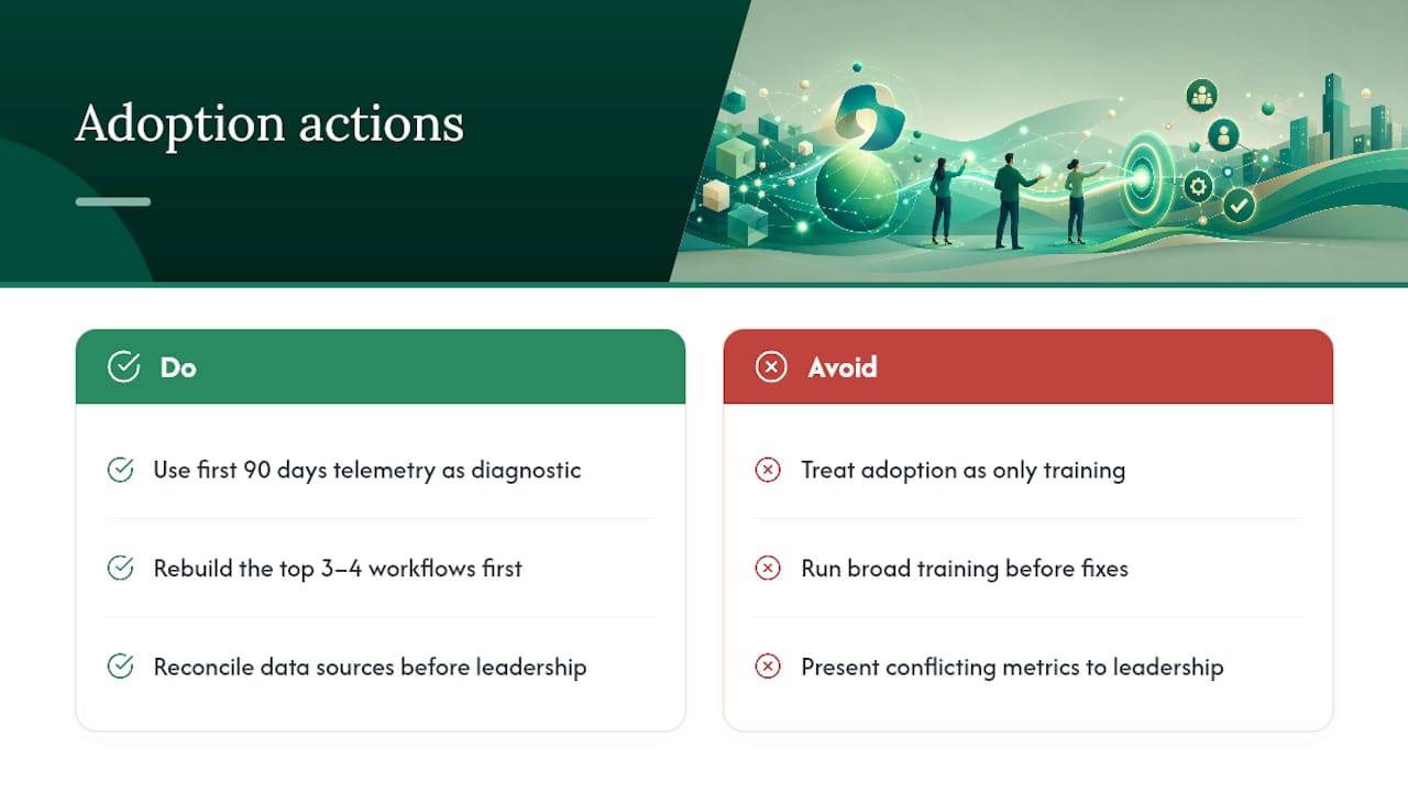
That’s the gap conventional adoption advice keeps missing. Training sessions move the needle for a week, then usage drifts back down, because the underlying process never changed. The firms that see real, sustained adoption are the ones that treat the first 90 days of telemetry as a diagnostic tool, not a report card. They use it to find which three or four workflows would benefit most from a rebuild, and they fix those before spending another dollar on general training.
If you take one thing from this article, prioritize reconciling your data sources before you present anything to leadership. A managing partner who sees the admin center number, the Viva Insights number, and the GitHub number all disagree will trust none of them. Get the story straight first, then make the case.
— Mad
Get Help Turning Copilot Telemetry Into Billable Time Recovered
Reading four dashboards and reconciling their numbers is one thing. Turning that reconciled data into a workflow rebuild that actually recovers billable hours is a different job entirely, and it’s the one Zera specializes in for mid-market law, accounting, consulting, and engineering firms.
Zera’s engagements start with a telemetry audit across your admin center, Viva Insights, and Purview data to find exactly where your dormant licenses and adoption gaps sit. From there, the Copilot business case work moves into workflow rebuilds and automation sprints using Python and n8n, so the tool fits how your firm actually works instead of forcing your staff to adapt to generic prompts. Firms considering managed security alongside their Copilot rollout should also look at partners like ArchiTECH MSP for cloud governance support. If your telemetry is already showing dormant seats or flat adoption curves, book a Copilot ROI audit with Zera and get a clear read on what those licenses are actually costing you.
Official Copilot Reporting Docs Worth Bookmarking
Keep these close for whenever you need to double check a metric definition or pull a fresh export.
- Microsoft 365 Copilot reports for admins for a full map of all four reporting sources.
- Microsoft Copilot usage report for enabled vs. active user definitions and export steps.
- GitHub Copilot usage metrics for developer-side metric definitions and NDJSON export details.
- Viewing the Copilot usage metrics dashboard for latency expectations and API guidance.
Sources
- Microsoft 365 Copilot reports for admins
- Microsoft Copilot usage report
- GitHub Copilot usage metrics
- Viewing the Copilot usage metrics dashboard